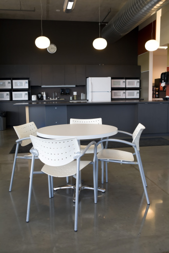
Creating the Ideal Office Cafeteria
Does the idea of walking into your office cafeteria bring up horrific memories of that first 7th grade lunch period? An office cafeteria should have a very different feel than your middle school experiences, and careful design can help ensure that’s the case. Not sure how to make certain that your new office lunch room seating does nott turn into 7th grade all over again? These tips can help. 
- Go with a Restaurant Feel. While family style eating might be appropriate if you have more than one cafeteria in your building, it’s not the best option if you just have one place to eat. Instead, you want your employees to feel comfortable, and restaurant style eating is a good way to do just that. Add some booths in there. Go with some pub style tables. Vary the seating a bit, and your employees won’t feel quite like they’re headed back to school.
- Consider Capacity. You certainly want to make sure you have enough space in your cafeteria area, so don’t forget to think carefully about how many people you can seat. If no one can ever get a seat in the cafeteria, they’re certainly not going to plan to eat there on a regular basis. Don’t let these calculations terrify you into going with communal tables. There are many different seating options that still give you the café style you want without resorting to long tables with bench seats.
- Consider Other Design Features. Seating is a big part of any cafeteria, but there are other design aspects you may want to factor in as well. Think about your choice of artwork, flooring, and even accessories like drink stations and pay stations, as they can affect the flow and feel of your space as well.
The office cafeteria can be just as hip as you want it to be. Don’t forget to factor the right seating choices into your redesign, and you’ll be on your way to creating a Google-esque feel for your employees.


