Making a Difference: The Ace Hardware Project
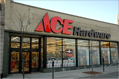
With a name like Ace, you can be sure almost everyone knows what you’re talking about. Created in 1924, the branding strategy this company has employed has made it a household name for decades. We were nothing short of honored when Ace came to us to work on their corporate headquarters. The goal was to create a new look for their lobby, a common area, and an essential conference room. The results were pretty impressive, even to us.

Serious Design Needs, Serious Results
With a company as large as Ace, aesthetics needed to be at the forefront of everything we did, particularly given that much of our work would be on display on a daily basis to a variety of different visitors. Nothing we did within this project could be business as usual. You simply don’t get a job like the Ace Hardware headquarters without already being the best of the best.
To meet their needs, we used a mix of custom millwork applications, employing both acrylics and poly resin panels for a finished look that you just can’t get with other materials. The goal here was that high end architectural finish that really demonstrated our skills as a millwork provider, and we certainly met that goal.
Promoting the brand was also important to Ace in all of the areas where we worked, so we added new signs to help boost the company’s name. Getting that logo above any real traffic area was a must, so we used 3FORM, high design image captures with acrylic feature panels to help push the brand out into the open while still staying with the current atmosphere.
The chance to work with Ace was unique, and we’re proud to have been part of the project. Our millwork skills are second to none, and a quick visit to the Ace lobby will show you nothing less than perfection.


